
Creating a Pseudo-Dialog with Silverlight's Popup Control

Creating a Pseudo-Dialog with Silverlight's Popup Control
Url: http://wilderminds.blob.core.windows.net/downloads/popupfun.zip

Originally I had planned to start my screencast this week with a how-to on creating a sort of fake dialog window in Silverlight 2. Unfortunately I got the flu so I’ve decided to put off the screencast for another week but share with you how to create the fake dialog, but in full fidelity text and code examples. If you cross your eyes, it looks like its even in 3D.
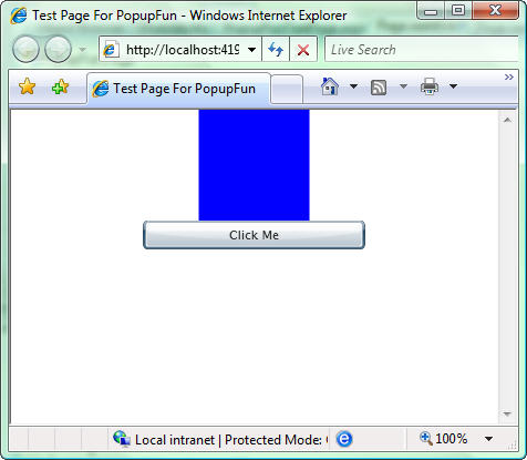
The cornerstone of creating a fake dialog in Silverlight 2 is the Popup control. The Popup control is a special container that when shown always shows up over other controls without taking up any space. For example, here is a simple Silverlight 2 app with a Rectangle and a Button. In addition, we’ve added a Popup with a simple Grid inside it:
<UserControl x:Class="PopupFun.Page"
    xmlns="http://schemas.microsoft.com/client/2007"
    xmlns:x="http://schemas.microsoft.com/winfx/2006/xaml"
    >
  <Grid x:Name="LayoutRoot" Background="White">
    <StackPanel Width="200" Height="200" VerticalAlignment="Top">
      <Rectangle Fill="Blue" Width="100" Height="100" />
      <Button x:Name="showButton" Content="Click Me" />
    </StackPanel>
    <Popup x:Name="fakeDialog">
      <Grid x:Name="theBack" Background="#80000000">
        <Grid.RowDefinitions>
          <RowDefinition />
          <RowDefinition Height="Auto" />
          <RowDefinition />
        </Grid.RowDefinitions>
        <Grid.ColumnDefinitions>
          <ColumnDefinition />
          <ColumnDefinition Width="Auto" />
          <ColumnDefinition />
        </Grid.ColumnDefinitions>
        <Border BorderBrush="Black"
                BorderThickness="2"
                Background="WhiteSmoke"
                CornerRadius="15"
                Grid.Column="1"
                Grid.Row="1">
          <StackPanel Margin="8" Width="200" >
            <TextBlock TextWrapping="Wrap">
                This is just some sample text. It doesn't
                matter what it says as long as it is long
                enough to actually wrap
            </TextBlock>
            <Button x:Name="closeButton"
                    Content="Close"
                    VerticalAlignment="Bottom" />
          </StackPanel>
        </Border>
      </Grid>
    </Popup>
  </Grid>
</UserControl>
When we show the page initially, the Popup is hidden (because it’s IsOpen property is false by default):
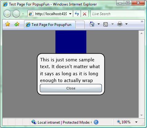
But when we change the IsOpen property (in the **Click **eevent of the Button),. the Popup is shown on top of the existing content:

What is particularly interesting about the **Popup **control is that it takes no space in whatever container it resides in. The Popup control is meant to shown over the existing content. The problem is that you will want to take over the entire screen with the fake dialog. In this case the size of the Popup won’t cover the entire screen by default. To fix this we can register for the **Application’**s Resize event to change the size of the Grid (named “theBack”) inside our Popup:
App.Current.Host.Content.Resized += (s, e) =>
{
  theBack.Width = App.Current.Host.Content.ActualWidth;
  theBack.Height = App.Current.Host.Content.ActualHeight;
};
This will resize the Grid whether the Popup is shown or now. Now that we have the resizing code in place, the dialog takes over for the entire screen:
There are a number of things you can do with a Popup control, but this should give you a quick primer on how the Popup control really works. The source project can be downloaded at the link above.
